Over Saturated? Editing Photography
Earlier this year while doing the Utah Arts Festival in Salt Lake City someone made a comment that stuck in my mind. This person said in reference to my image “The Green Cellarium” something like “the colors are so vibrant and overwhelming, I don’t think I could have something that bright in my home.” This comment got me thinking and now months later I think I will address it.
I glanced over a blog post today on Facebook that another photographer made about shooting in RAW and editing the images. In the comment sections many people said the bloggers image was “too processed, over saturated.” I didn’t think that when I looked at the image, I thought it looked fine. Then I had an epiphany. Most people in the world have a problem with their eyes. Ok I know that sounds bad and it isn’t really what I mean. What I mean is their eyes are accustom to looking at their under saturated unprocessed images and so something with lots of punch looks overdone to them. Let me explain it this way, have you put on a pair of colored glasses? Yellow works best, when you first put on the glasses everything seems too warm and yellow. After you have the glasses on for a few minutes your brain adjusts and you don’t notice the yellow hue anymore. Then you take off the glasses and everything seems blue, again it takes your brain a few seconds to adjust back to normal. This example is over exaggerated but I think you get the point. The human brain color corrects images to how we think they should look. Our brain has a auto white balance and we have to train our eyes to see color the way it actually is not what we think it is.
The images below show an original file unedited and the edited version. Looking at the original file a person may think it is fine, but once they see the edited version their brain changes and they can then see the issues with the original.
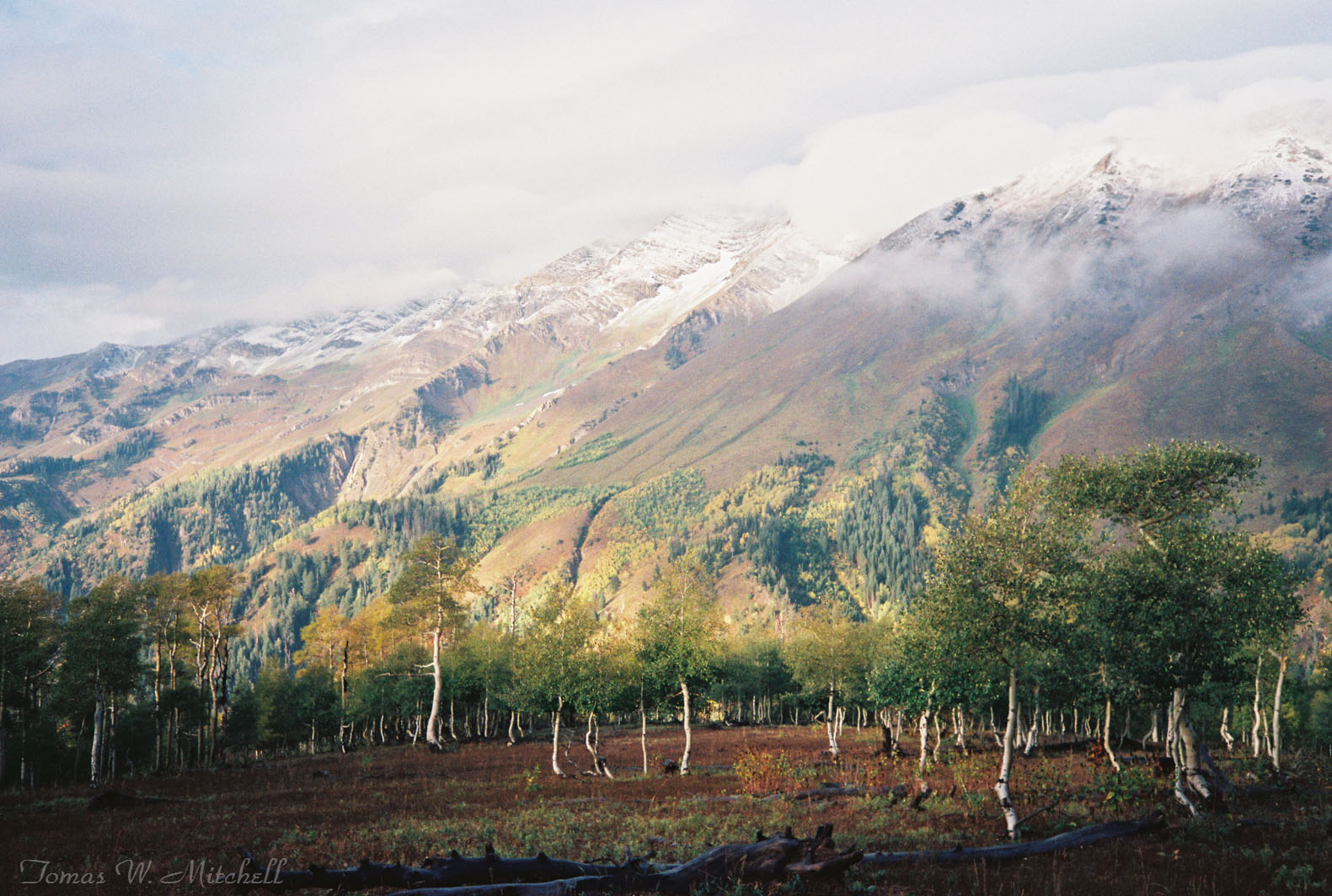
Dancing Trees Original Edit.
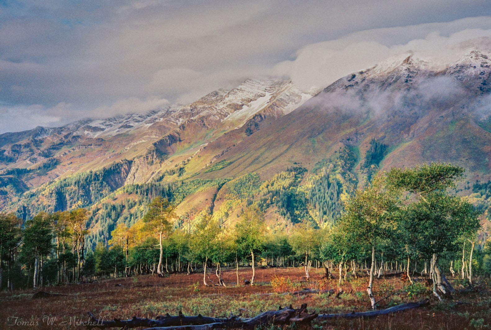
"Dancing Trees" final edited to bring photograph more in line with what I saw that morning.
Years ago when I first got into photography I remember coming upon a photographers display in a park. The images were brilliant, saturated, and beautiful and miles above what I was doing at the time. I talked with him about how he got such wonderful colors; mind you this was all on film. He told me the first step was using good film. He was shooting with Fuji which was known for brilliant reds and greens. The next step he said was getting a good exposure, one that captured the scene perfectly. The third step he said was getting the image printed on high quality paper that really had great contrast and color. I remember being inspired by his work and wanted mine to look the same because by comparison my work looked dull and lifeless. My eyes were accustomed to seeing my own work so his really jumped out at me.
“Forest Fire” Original film scanned image with no editing.
“Forest Fire” Edited to give the image more depth and detail.
So, are my images too over saturated and processed? Sure, some of them are. I get the distinct impression that many other photographers think so and because of this they think I don’t know what I am doing. That is fine I don’t find all of their work overly exciting. We each have our own tastes, that is what makes us individuals and it is a good thing! I will be the first to admit that, for example my image “The Green Cellarium” is overdone. If you look at my last blog post I have an example of it unedited and then the edited version. Some people really like the unedited original. I don’t, I find it flat, boring and not at all what I saw that day. As I stood in that dark, dank, wet abbey cellar and my eyes adjusted I started seeing green, lots of wonderful green moss growing on everything. I then saw the amazing stone work and the contrast between the yellowish stone and the mortar in the joints. I saw the hue of the gravel floor and how the lighting gave it a purple cast. My eyes have been trained to see such details because of years and years of doing photography and printing other people’s images. I have been in the industry of printing photographs for over 30 years now and my eyes see the world how it is not how our brain is programmed to see it. A perfect example of this is shadows. Shadows photograph blue because they are blue but most people do not see it. Back when we shot only film that was just the way it was, shadows were blue. Now photographers will color correct the image and take the blue out of the shadows thinking they are doing a good thing. The reality is, to the trained eye, their photograph doesn’t look natural with the blue removed. Sure I remove some of the blue sometimes if I’m trying to reach a warmer tone and upping the saturation brings it out too much, but the color was there from the start.
So why do I “over process” my work? Because that is how I see the world. I know the RAW image as shot in the camera cannot duplicate what I saw. The camera sensor is not designed to work that way like film was, the information is there but in most cases it needs to be brought out, amplified, and adjusted to not only show what I saw but to also give it the vision I had when I was there standing in the spot enjoying the moment. Even film needs some help sometimes when the dynamic range of the image is too great for the film to capture perfectly.
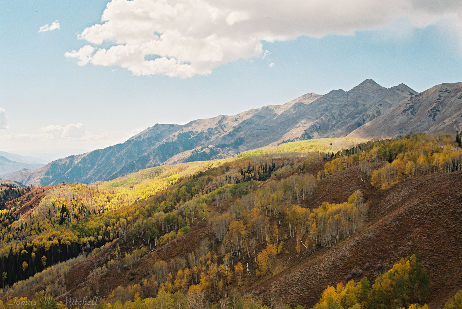
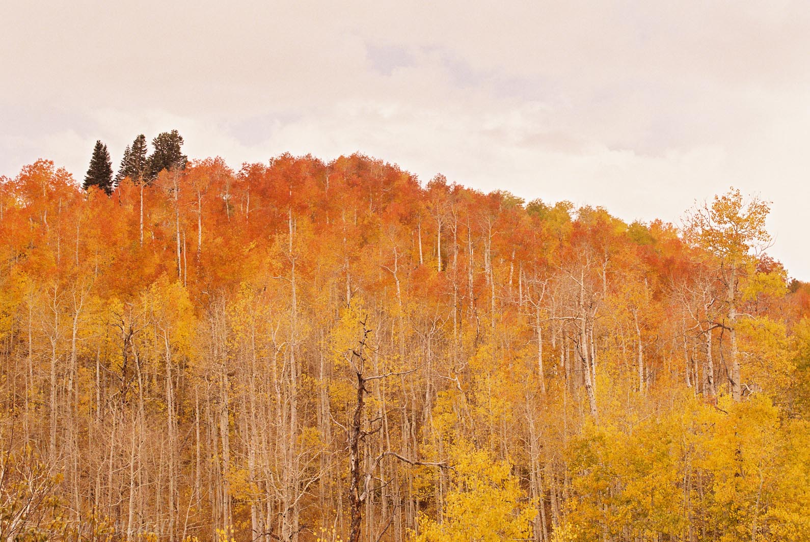
“Autumn Glow” Original unedited file.
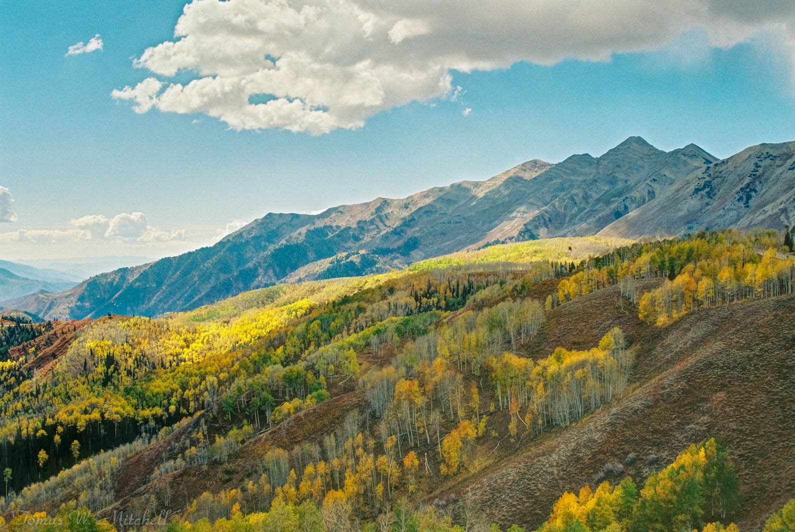
“Autumn Glow” Edited but I still wasn’t happy with the image

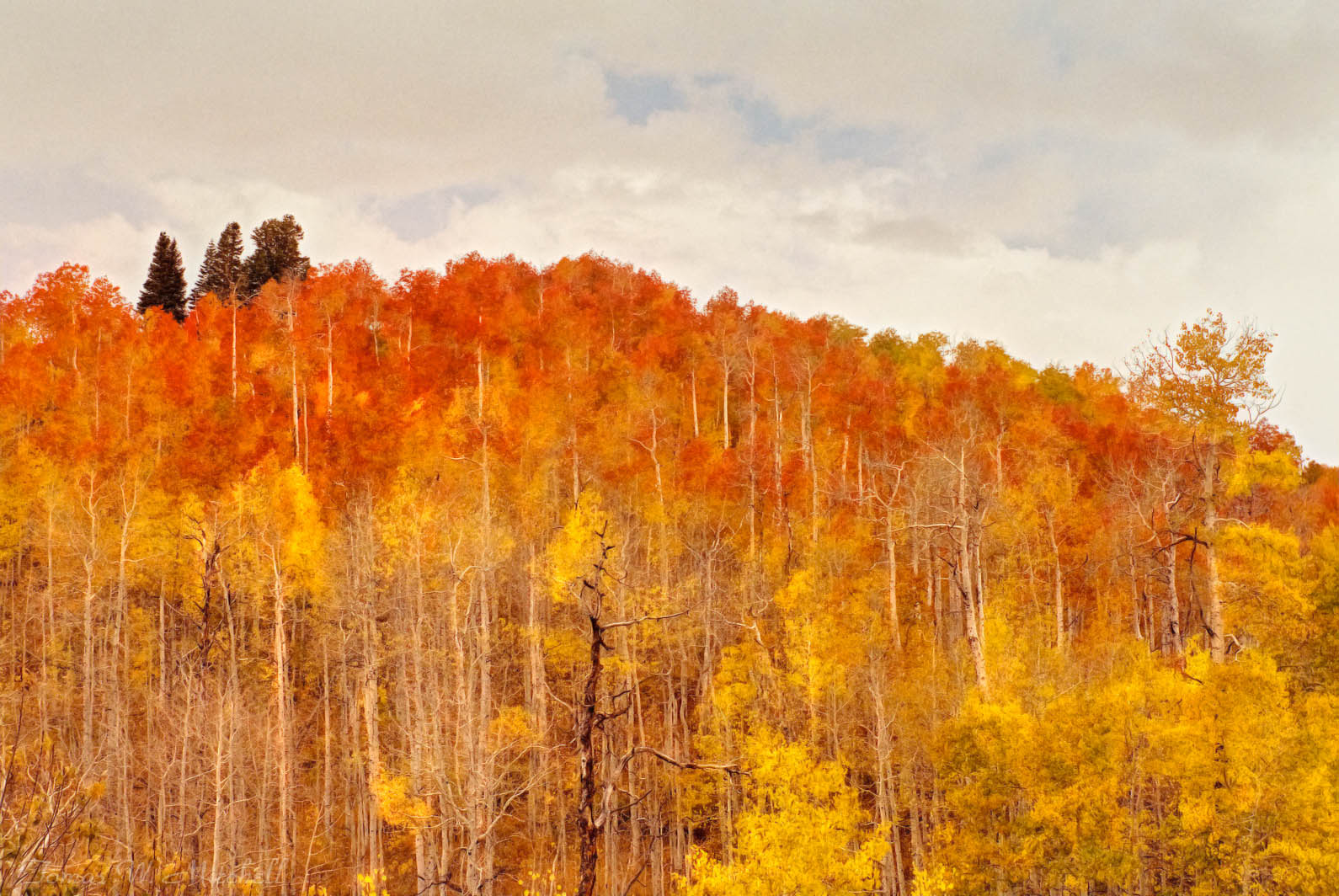
“Autumn Glow” Final edit, what I feel gives the image more depth and character.
A photographer that I have a lot of respect for who still shoots film, posted a picture on Facebook recently, someone critiqued it suggesting that he still needed to do some editing to make it perfect. The photographer’s response was that he shoots film and his images are a “unicorn free zone”. I had to laugh out loud. I got it and appreciated it! He has an original slide that he scans and then compares his scanned file to the original slide. If he does any editing it is to bring the scanned file more in line with the original film image. Film records light differently than a camera sensor. It has color characteristics, saturation and contrast that are different. So shooting film he doesn’t want to change what the film saw. I completely understand his perspective though I don’t always adhere to it. These images above show where I have film images I am just not happy with, so I play with them. Some people might think I play too much but as the artist with the vision, I have every right to play with my images and adjust as I want. I do think I have some responsibility to admit to my tweaking and not be ashamed of it but I think photography has always been about the artist’s choice of how they saw the image and how they want it to be seen by others.
Below is “Red Mountain Sunrise” Scanned film image with no editing. I love this image just as it is and never saw the need to edit it.
So there you have it, the unedited version of why I edit my images. I hope this explains where I am coming from. Now if you will excuse me I need to go find a unicorn!
Happy Trails!
Tomas Mitchell

Limited Edition of 25 Museum Grade, Fine Art Prints.
This photograph is part of Tom's film series of images taken between 1984 and 2006. Each image in this series is available in Limited Edition Fine Art printings of no more than 25 in the various Museum-Grade formats.
I took this image the end of September 2001 or 2002. I know what month it was, I’m just not positive of the year. I was muzzle-loader deer hunting on the north slope of the Uinta Mountains in Utah just a few miles south of the Wyoming border. I always carried a 1982 Pentax PC35AF pocket 35mm camera. I carried this camera for years when I didn’t want to carry an SLR and I have many wonderful images from it. On this morning, I parked my truck and took a short walk to the top of Red Mountain, a small mountain just off Forest Road 017. I found a perfect spot to wait for deer and the sunrise. As the sun came up and back-lite the golden aspen leaves I had to pull out my camera to capture the scene. Many times I find I love one of my images because of some fond memory I associate with it. This one is one of my absolute favorite. I never did see any deer but I still think I got a trophy that day.